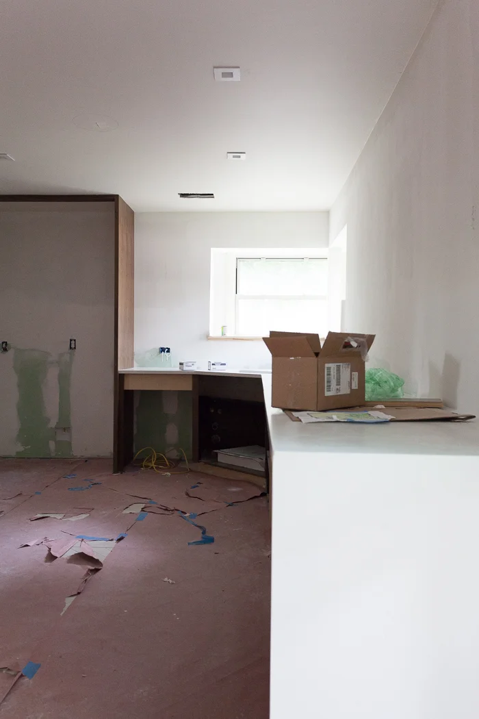
ONE ROOM CHALLENGE KITCHEN EDITION WEEK FIVE: LET'S DO THE TIME WARP AGAIN

Hello, and welcome back for the penultimate week of the One Room Challenge. Our mission is simple (ha): spend six weeks remaking a room, or in my case a kitchen and an adjoining study. Special thanks to our host Linda of Calling it Home and to media sponsor House Beautiful for their support in this insane endeavor. If you haven't been following along, you can catch up on previous weeks HERE.

You guys. I am real tired. I have never lived without a kitchen whilst raising two small children and working full time and blogging about the lack of aforementioned kitchen. I knew I was taking on a lot when I signed on the dotted line but THIS IS SERIOUS. I need at least two more weeks!!!

erin williamson design | one room challenge

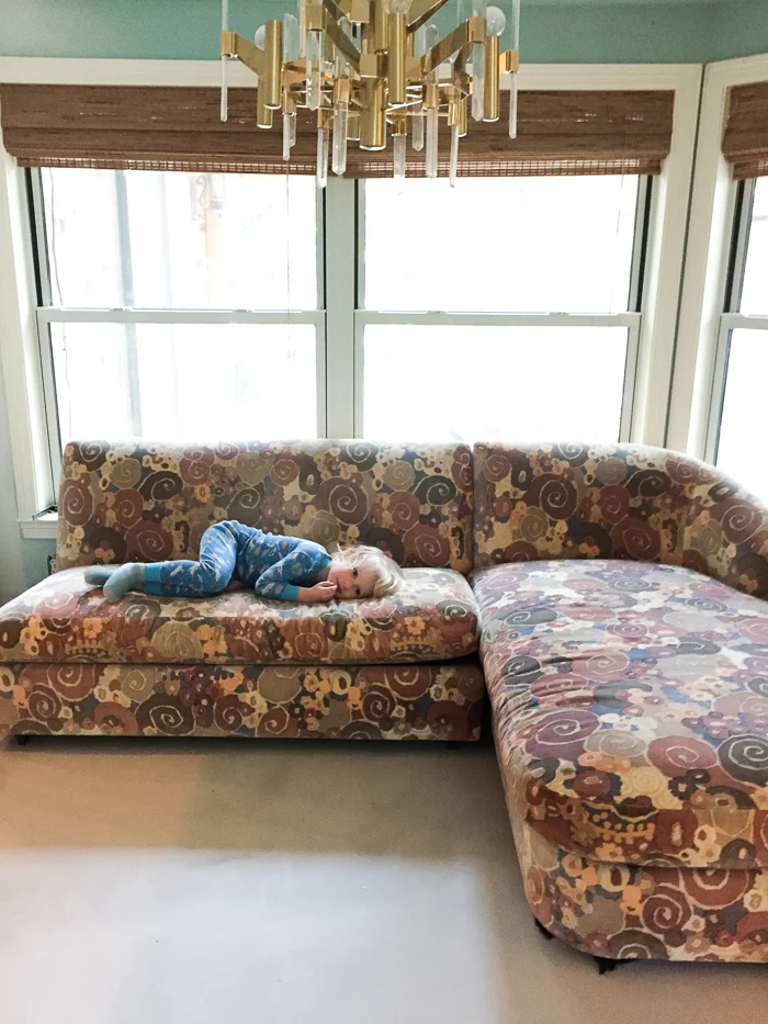
We moved this crazy vintage Jack Lenor Larsen sofa into the new study area for exactly five minutes to see if it would even fit, and my kids were so excited to see a soft surface without anything on it that zzzzzzzzz. Gillian Bryce (the most incredible art and vintage dealer and also most amazing person IN THE WORLD) sent it to me, and my husband is all like what?! about the pink and purple action, but it is stupid comfy and built like a tank. The lounge force is strong with this one.

erin williamson design

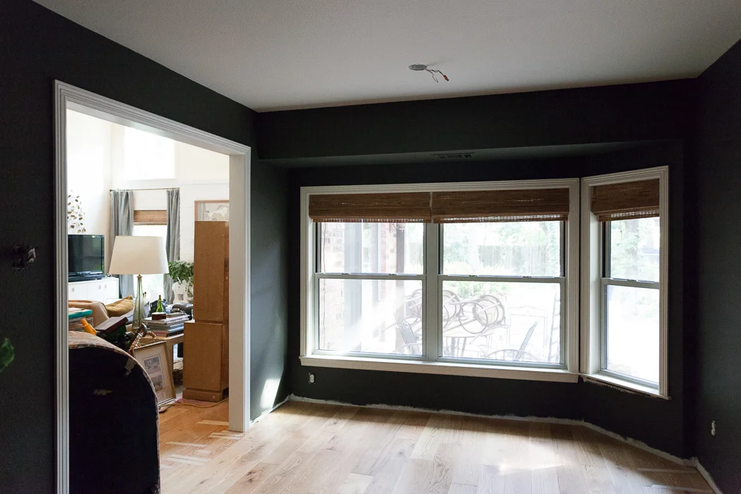
The floors are now in and the walls are painted all dark and moody like, so I'm hoping when we move that crazy sofa back in some magic will happen... you can see it lurking in the left side of the frame, just waiting to find its home. I would love to relocate our one and only tv that is rarely watched into this room so I can totally rearrange our great room. Because I need another project like a hole in my head.

erin williamson design | hudson valley

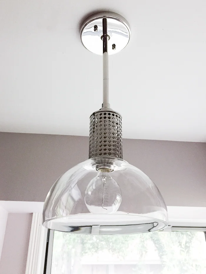
Meanwhile on the kitchen front, our Hudson Valley Halcyon sink fixture was installed. Thank you to Bellacor for furnishing this beauty! The metalwork was inspired by Josef Hoffmann and I am feeling very Vienna right now.

Perhaps you can tell from the background that the kitchen is not requisite white. It's Farrow and Ball Peignoir and it's so zen. Is it purple? Pink? Gray? Brown? it depends on the time of day. 

erin williamson design

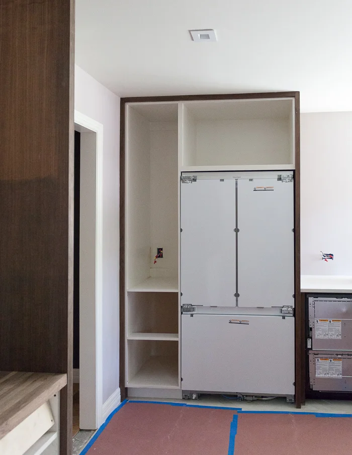
Not the greatest picture but you can see a slice of the color here, and tada! My brand spanking new amazing Fisher and Paykel appliances are installed. Panels are arriving TOMORROW for the integrated fridge and double dishdrawer. That's right... it's two dishwasher drawers that can be operated independently, which I am super pumped to test drive. We try not to run our dishwasher when it's less than full, so this will save us from hoarding stinky dishes for days.

top knobs | erin williamson design

Cabinet hardware has been ordered, yay me. Thanks to The Mine for supplying some lovely options from Top Knobs' Mercer collection. They have a new finish called sable that is extra dreamy and nicely weighted. Can you guess which ones I chose? I have to confess I agonized about hardware for longer than a human should, but at the end I decided to keep it simple and architectural. Also the husband may or may not have had strong opinions on this. Weirdo.

erin williamson design

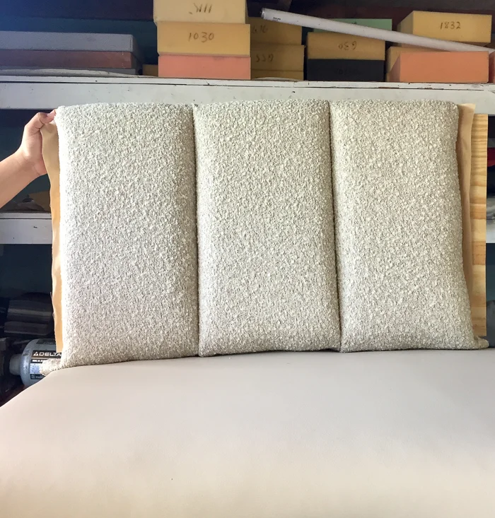
In furnishings news, the good folks at VMC Upholstery made a sample board of the banquette for me to approve channel size and tautness. The finished product will be all prettified and tight like a tiger. I love the teddy bear fuzziness of S. Harris' Medici on top and Trend's Faux Leather on bottom, both supplied by Fabricut. We chose super soft foam for the back to make it cozy and appealing because I have big plans to spread out while the children feed me grapes. Luckily that vinyl is wipeable.

nuevo echo table

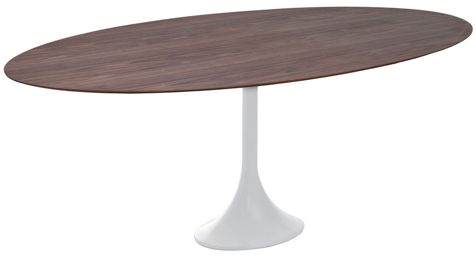
We'll be paring that sexy softness with this rugged hunk of walnut by Nuevo -- a classic shape for a banquette table, no? The pedestal makes for easy access, and extra chairs can be pulled around in a pinch. Thanks to The Mine once again for for their generosity! Now, can someone please come put this together?

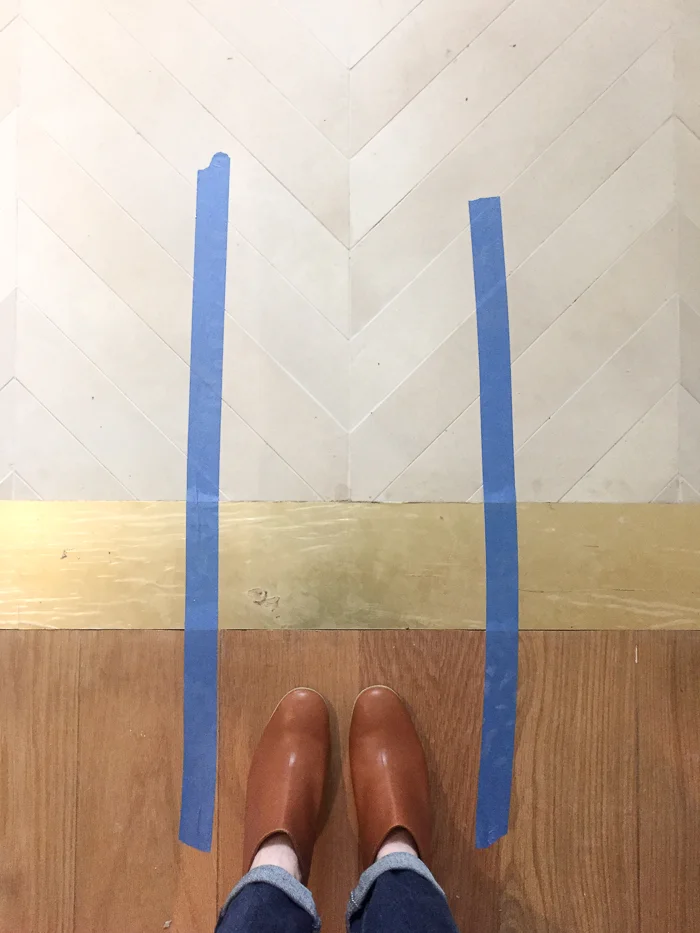
If you are following my Instagram, you caught this sneak peek of the brass transition we put in to divide the old oak flooring and new tile. This puzzle piece was giving me hives until I decided to stop trying to make either the wood or the tile work as a transition piece. When finished it will all be flush and grouted/puttied to perfection.

erin williamson design

Thanks to Austin's resident fabricator extraordinaire Brian Chilton for cutting and supplying these pieces. Brian is also making my extra fancy hood, which has been delivered and installed but I simply cannot show you yet because SUSPENSE.

Last but not least, when I say this has been a grueling experience I am grossly understating things. Thanks are due to many many people whom I will happily credit at reveal, but I have to acknowledge that none of this could have happened without our contractor Carl Dixon of Total Performance Construction. When I told him I wanted to do this super fast and super good for super cheap, he didn't laugh in my face. This process has not been without its hiccups and I am STILL agonizing about some of them, but he has been here every day and answered all of my 1000000 texts (I exceeded my million text limit this month). So... thank you, Carl.

erin williamson design

We like to debate about politics and we disagree about pretty much everything (I am right, obviously), but we are still friends and that's the way the world should be, by golly.

And that, dear readers, is it for this week. When next we see each other I will have a working kitchen and you will have beautifully photographed evidence of aforementioned working kitchen. Are you excited???

Wish me luck! And sleep. I'm going to need it. Until then, adieu and please go spy on everyone else's progress and report back!

Centsational Girl | Chris Loves Julia | Christine Dovey | Dwell With Dignity | The English Room

Glitter Guide | House of Brinson | House Updated  | J+J Design Group | Lark & Linen | Abby Manchesky

Nesting Place | Old Brand New | Old Home Love | The Pink Pagoda | Rambling Renovators

Erica Reitman | Sketch 42 | Suburban B’s | Media Partner House Beautiful | TM by CIH
ONE ROOM CHALLENGE KITCHEN EDITION WEEK FOUR: IN THE DOLDRUMS

Hello! And welcome back for week four of the One Room Challenge, wherein I treat yo selves to a six week long dear diary of how my kitchen and adjoining study will be completely renovated, hopefully with all brain cells intact. Thank yous are due to our lovely host Linda of Calling it Home, and to our media sponsor House Beautiful for helping to make this happen. Catch up on previous weeks HERE.

You know that movie A Perfect Storm, where they are steering a tiny boat up a ginormous wave, and daring said huge wall of water to capsize their puny glued together stick shelter? I think that sums up week four. This ain't my first ORC rodeo and I knew week four would be hard, but it's still a bit shocking once you're climbing up that wave.

erin williamson design | one room challenge

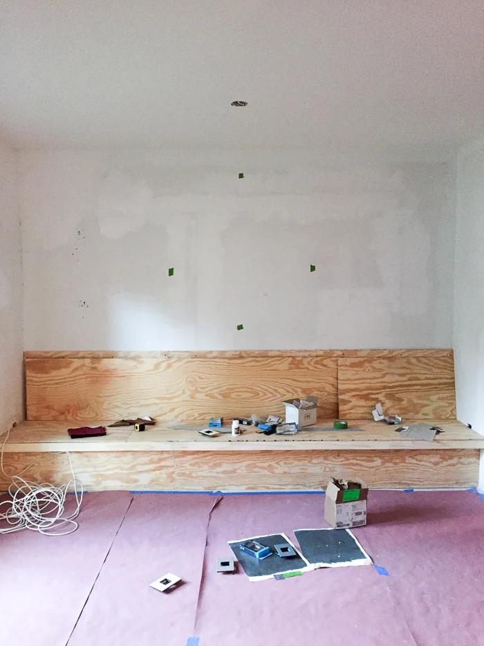
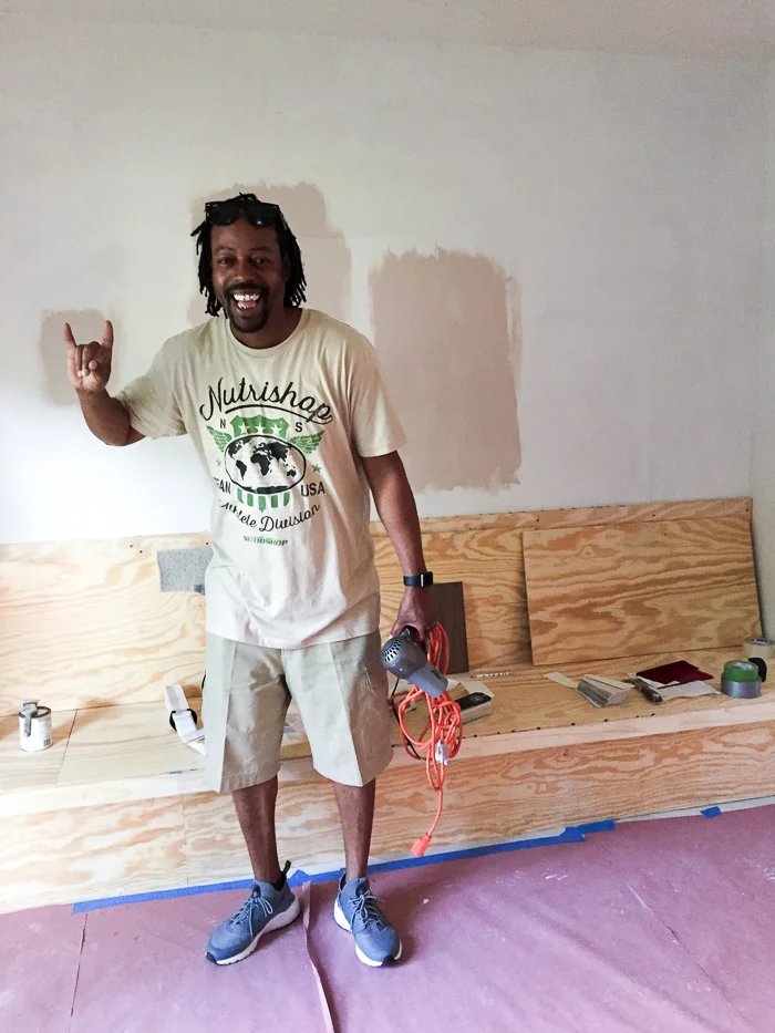
Nevertheless, it is not a complete downward spiral towards a whirlpool of despair. A platform for the banquette I mentioned last week is built, and the important pieces have been dropped off to the upholsterer (bless you, VMC upholstery for rushing this through!!!). Bellacor is generously supplying the most fantastic Legrand switches and outlets, which you can see me testing against paint swatches. More about that later...

erin williamson design | one room challenge

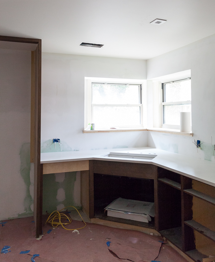
Most joyously we have some base cabinets and counters and a sink! I am feeling pretty stressed that we don't have more cabinetry at this point, but the construction industry in Austin is crazy and everyone just has to wait patiently... Except I am on a tight deadline and I'm tired of living with a fridge in my living room and I'm teetering on toxic levels of deli meat build up. 

erin williamson design | one room challenge

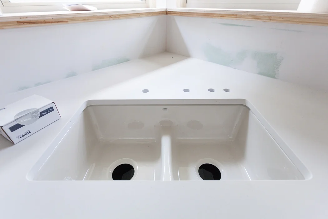
Still, A SINK! AND COUNTERS! Ahhh it's so beautiful I could cry... I think I am crying. So, the counters are gorgeoussss Caesarstone Fresh Concrete. It's so pretty and matte and indestructible, which is great because wine. The sink is Kohler's Deerfield smart divide in the sexiest custom color called Dune. I could not love it more with the counters! We went with a low divide because I tend to have a dirty and clean side of the sink, and never the twain shall meet. But this is still low enough to wash big pots and pans.

Now if they could just hook this baby up to running water I think I'd crest that wave.

erin williamson design | one room challenge

A little Caesarstone waterfall (sea metaphors paying off) counter action at the end of the cabinet run. Oh yeah we did. Also the cans are in (apparently I need to straighten them, ahem) and that faint circle drawn on the ceiling represents future speaker homes. We plan to party in here... once the paper is gone, and we have electricity and running water and a refrigerator. Gah, we have a long way to go!

You are probably wondering what I plan for the backsplash. The answer to that is nothing. Behold:

lauren liess kitchen

This is Lauren Liess' beautiful kitchen and she has zero backsplash. Nothing. Nada. Zip. I read somewhere that she keeps a can of touch up paint under the sink for smudge repair, and I'm going to try it. I don't need anything behind my deep corner sink, and there isn't really a way to gracefully end a splash between the corner windows and the tall window. Plus there is already a lot of tile happening with the floors. I have a Plan B to deal with this if I hate it after six months, so don't worry about me too much.

erin williamson design | sanders gibbs

Speaking of paint, I am wrestling hard with the paint demon. The notorious Sanders P. Gibbs (SPG) came to help me. Am I painting this crazy room pink??? I am not a white wall person, but I want something airy and architectural. This is tough... I really love my dark moody walls but not in here.

erin williamson design | one room challenge

And speaking of dark moody walls, my little helpers transformed the new study space into a cozy corner. Primer first! Here's a sneak peek:

erin williamson design | benjamin moore dragons breath

I love dark paint and I cannot lie. The color is Benjamin Moore Dragon's Breath, and it's kind of a greenish charcoal that looks muy fantastico with brass. Ps, this torchiere has been MVP during the renovation since we have zero electric in the kitchen and can only bring lighting in via extension cord. It's covered in plaster but is still the most glamorous work light ever.

erin williamson design |  the shade store

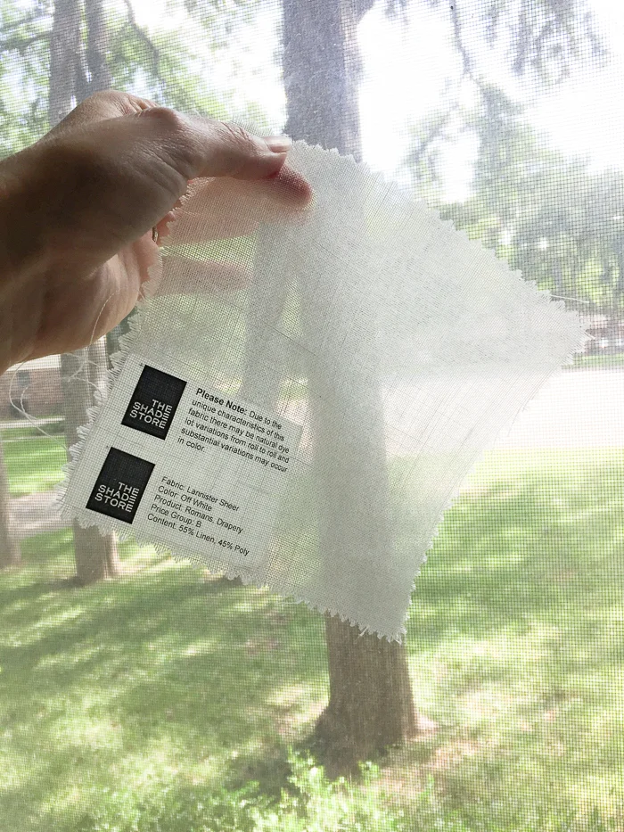
And finally, let's leave on a high note with my Shade Store order for fabby grown up window treatments. We use The Shade Store for our design projects often, so I was over the moon to find they are sponsoring this round of the ORC. I choose this ultra sheer fabric for relaxed romans at the corner window and minimalist ripple fold drapes at the tall window, paired with a roller shade for privacy. Can't let the neighbors see us dancing at night.

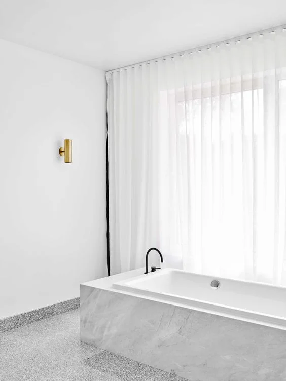
flack studio bathroom

Well, that's gorgeous. Maybe I should do the bathroom next? Just gotta get over that wave first. Bathroom by the fabulous Flack Studio.

Until next week, my friends. And please do see what progress the other designers have made this week!

Centsational Girl | Chris Loves Julia | Christine Dovey | Dwell With Dignity | The English Room

Glitter Guide | House of Brinson | House Updated  | J+J Design Group | Lark & Linen | Abby Manchesky

Nesting Place | Old Brand New | Old Home Love | The Pink Pagoda | Rambling Renovators

Erica Reitman | Sketch 42 | Suburban B’s | Media Partner House Beautiful | TM by CIH
 

ONE ROOM CHALLENGE KITCHEN EDITION WEEK THREE: BEING AND NOTHINGNESS

Welcome back for Week Three of the One Room Challenge, wherein I chronicle the renovation of our kitchen and adjoining study over the course of six weeks. Many thanks to our host Linda of Calling it Home and to our sponsor House Beautiful for putting my feet to the fire, because we all know this would not be happening otherwise. Catch up on previous weeks HERE.

Well, well. Here we are at the halfway point, and bleep is getting real. It was all fun and games when we still had a sink, but those days are gone. We trucked through a super long week, so grab the popcorn while I regale you with scintillating tales of gypsum and epoxy.

erin williamson design | one room challenge

This picture might be too pretty for the ugly reality of the situation, which is that running water is the essence of modern civilization. We acclimated quickly to no oven, and I think we could have easily moved over to barbecue after the range top went, but no sink is the pits. This gives me a new level of wonder and respect for communities where obtaining clean water on a daily basis is a struggle. And we have a powder room around the corner... let's just say I am incredibly grateful to live in a place where this is not the norm and I don't ever want to take my sink for granted again.

Meanwhile, I can say I'm excited about what's happening over on this wall:

erin williamson design |one room challenge

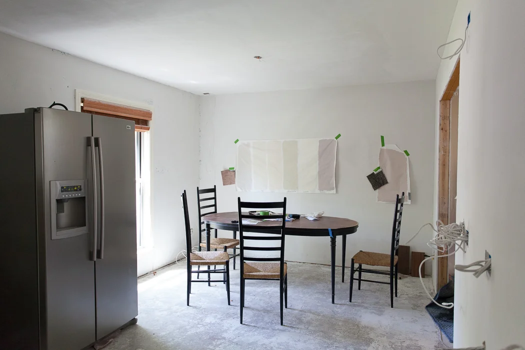
No, not the stainless behemoth I can't wait to relocate to the garage (it's going to fit, right???). If you read my post last week you know I was hemming and hawing about wrapping a banquette around the corner and in front of the window. Once we enclosed the old entry we found ourselves with a long void, so we decided to run a custom banquette across the new back wall. Our aging table and chairs are filling out the space just to triple check clearance. Forget measuring twice, measure 50 times before you spend those dolla bills on custom upholstery.

erin williamson design | one room challenge

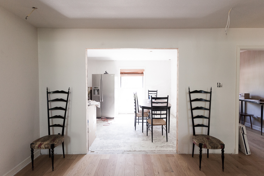
Here's the view from the living room side, where I am thinking the old teal shelves might find a new home. I'm pleased that running the banquette along the back wall will allow more light in from the window. BUT... when we decided to run the banquette across the wall edge to edge I realized we had to enclose the right side of the wall opening in a bit more to allow for plenty of seating depth. This meant adding more drywall, texture, re centering overhead lights, etc. It was all for the best, as now the opening is centered on the window, but my point is every change order unleashes a world of hurt on the most wonderful framing crew in the world. Thanks guys for never making me feel like a jerk. I sincerely appreciate it!

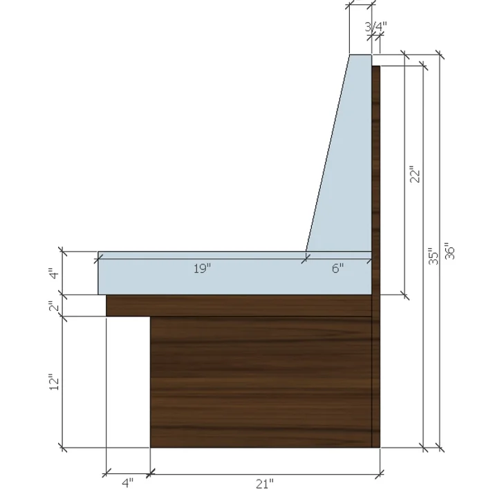
Here's the plan for the banquette, drawn by my super fabulous right hand woman Lindsay:

erin williamson design | one room challenge

No one wants to sit on an 18" deep piece of plywood, so build it out fat and cushy if you have the space.

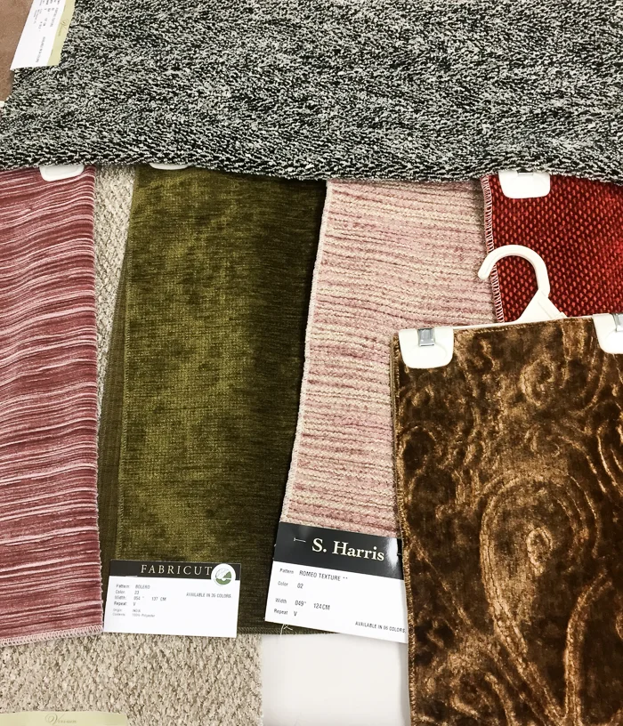
I think this is going to be tres awesome, especially with ultra swanky fabrics from Fabricut, who is generously sponsoring us:

erin williamson design | fabricut

Behold a sampling of some inspiration fabrics. I am SO EXCITED about this! Have you seen the fabulous 20 ft long wall of raw silk drapery from Fabricut we used at Project Mid Mod?

erin williamson design
erin williamson design | project mid mod

Heaven. I'm a big fan of their products.

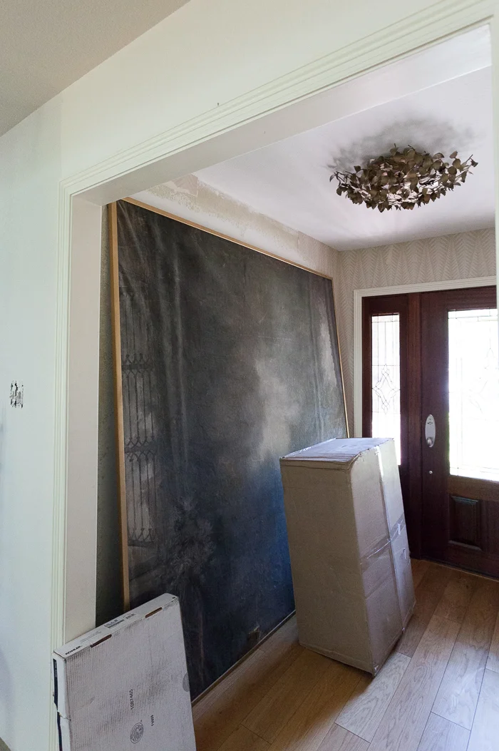
Meanwhile back at the ranch, gaining the banquette wall means losing my wallpaper in the entry. I am going to be 100% honest when I say I don't think I'm going to be able to pull the trigger on new wallpaper before the challenge time clock hits doomsday, hahaha I mean REVEAL DAY.

erin williamson | one room challenge

Zoinks. This whole entry needs a makeover, including new glass in the doors. I loved my Neisha Crosland paper but three walls are damaged and I'd pretty much have to start from scratch at this point. I'm not sure what to do, so I will probably do nothing right now. And somehow the Victorian backdrop has to get into our bedroom. It might have to teleport.

erin williamson design | one room challenge

In the interest of my sanity let's focus on decisions I have made, including wood stain from Rubio Monocoat (thanks for the tip, Lewis Trimble!). On the left is Cashmere Brown and on the right is Intense Gray. I chose the one on the right, and it's almost like a watery toner you apply before the final coat of sealer -- in our case Waterlox. Walnut can be kind of psychedelic and this masks some of the craziness while letting the grain show through.

erin williamson design | annie selke

If you are following along on my instagram, you know that the floors are in! Unfortunately all I have are grainy nighttime photos because as soon as the guys grouted they covered them with paper. So... I haven't even really seen them in daylight yet. Cue hysteria. I did have time to test drive this awesome rug from Annie Selke that I had been planning on, and I'm not sure the scale is going to work. I LOVE THIS RUG. It's so soft and I'm all about the checker pattern. I am crying tears of sadness because my heart and mind are not aligned. Get straight, Sybil!

If your brain is faster than mine, you have realized that floors going in means everything that was in the room must come out...

erin williamson design | one room challenge

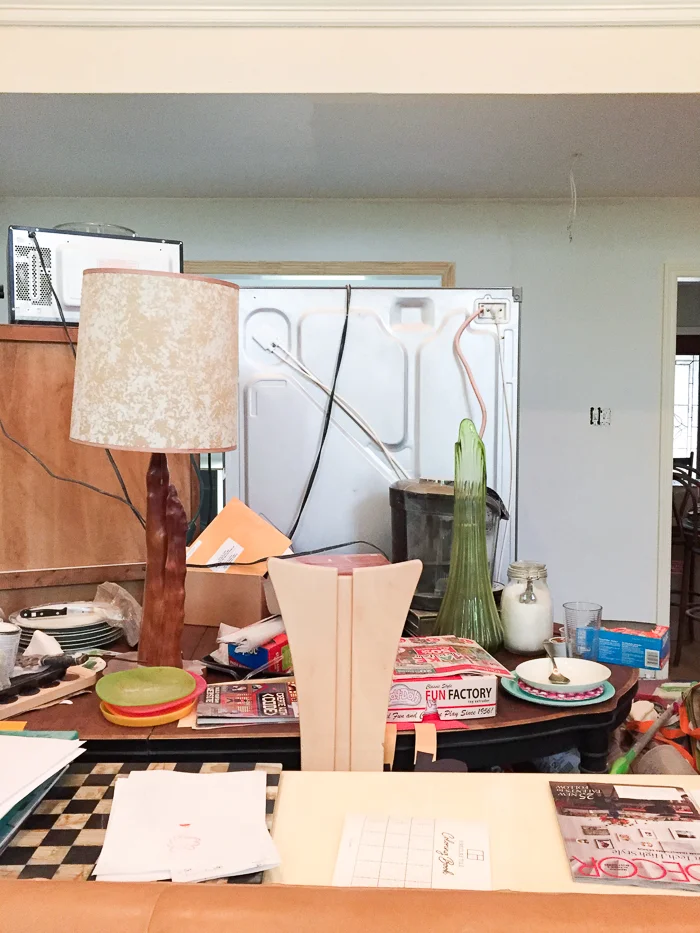
That was my desk. Send in the jaws of life. At least the beer is closer... because the fridge is in the freaking living room. You can only use the toaster or the microwave, because using both at the same time blows a fuse. I have to laugh or I might pound my face into the wall.

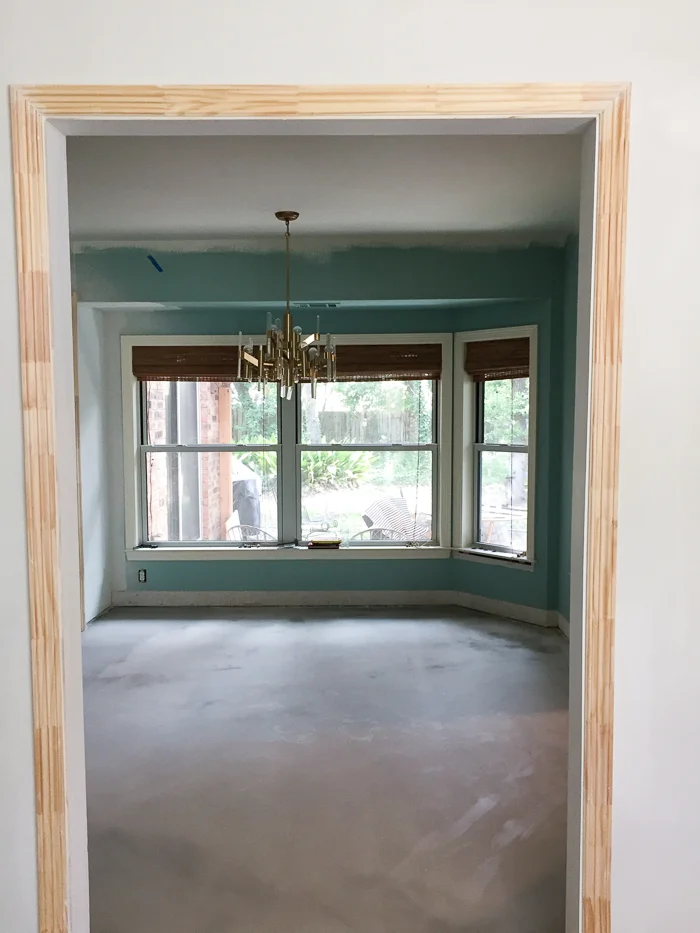
And so, dear readers, let us all leave with this moment of zen. The adjacent kid zone needs a complete redesign, including paint, seating, desk, and lighting... unless you enjoy being impaled by a precariously low Superman's fortress of solitude chandelier. Nevertheless, it is blissfully empty and ready for wood flooring. Yep, this room is getting wood since it's lower traffic and I want it to feel cozytown USA. It also flows better with the floorplan, and it is much easier to continue flooring horizontally than to patch it running vertically.

ERIN WILLIAMSON DESIGN | ONE ROOM CHALLENGE

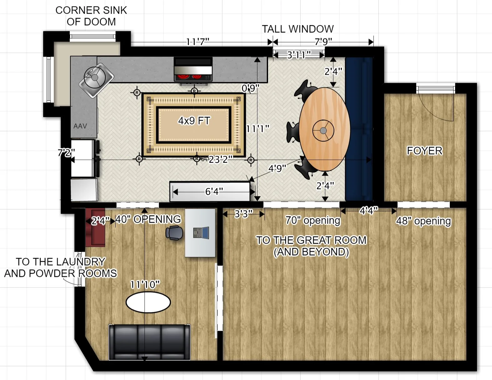
Here's the floorplan as it stands now. All the fun details will be revealed in weeks to come... Right now I hear five gallons of primer calling my name. YAY.

Feel free to come over and help, but before you bring me pizza and pats on the back check the other 19 designers for progress on their projects!


Centsational Girl | Chris Loves Julia | Christine Dovey | Dwell With Dignity | The English Room

Glitter Guide | House of Brinson | House Updated | J+J Design Group | Lark & Linen | Abby Manchesky

Nesting Place | Old Brand New | Old Home Love | The Pink Pagoda | Rambling Renovators

Erica Reitman | Sketch 42 | Suburban B’s | Erin Williamson  Media Partner House Beautiful | TM by CIH