Leos Rule

Over the past weeks I have started writing 500 amazing posts about art and design as well as projects I am working on, but then I get waylaid by said projects and this here blog suffers the ignominy of playing second or third or last place fiddle. Also I live in fear of rejection... what if my first post in forever isn't good enough? Truth is, it never will be. Stage fright is the thief of awesomeness. Whatever. It's time to get back in the saddle because a very important event has forced itself upon us and must be addressed. Today is my birthday. Who am I kidding? This is the worst day of the year. But there is one redeeming factor to consider, for it is the only time of the year I suspend my belief in reason and succumb to the whims and half baked vagaries of mysticism. I'm talking about astrology.

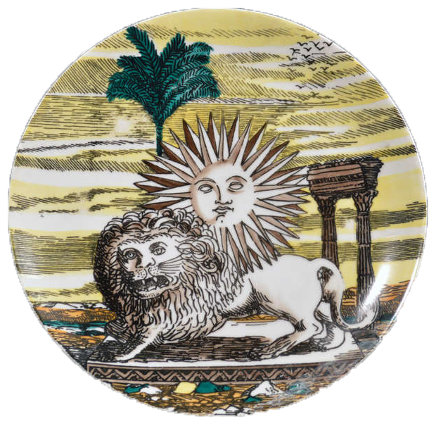
fornasetti lion and sun

Logically, believing that all people born within the same arbitrary date set share similar characteristics makes zero sense. And yet... we leos do run in packs so it's easy to note that there is some common cross section. Pareidolia? Perhaps. But if you're a leo, see if you can check off these boxes with me: we are vain but generous. We are honest and loyal. We are bossy little jerks and we like to get our way because we are always right. We have good hair.

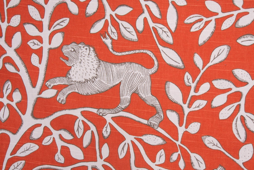
We also have the best sigils, and because we are king of the zodiac we get two! Everyone loves the sun, and everyone loves lions. Unless they are Lannisters.

fornasetti sun wallpaper

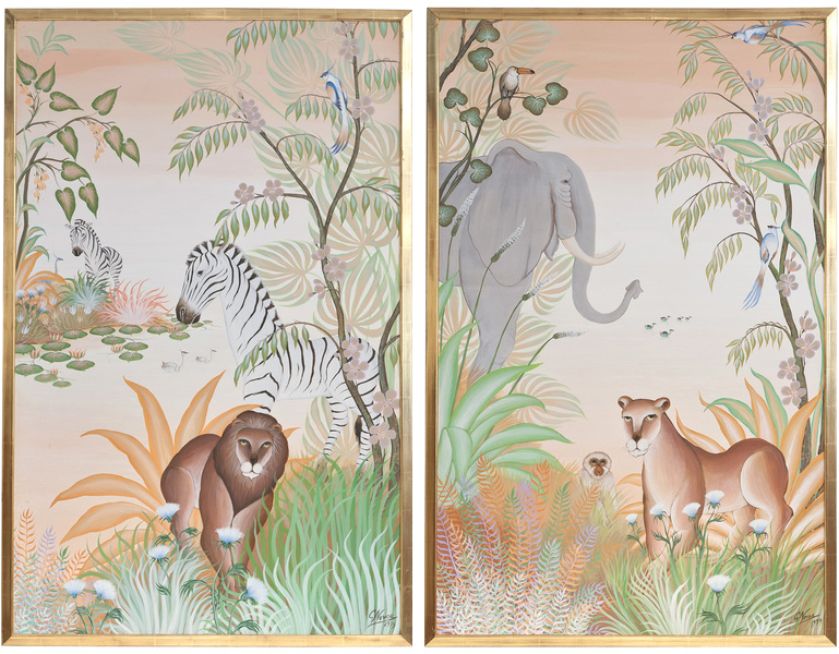
henri rousseau lion

fornasetti sun

design crisis |leos rule

design crisis | leos rule

design crisis | leos rule

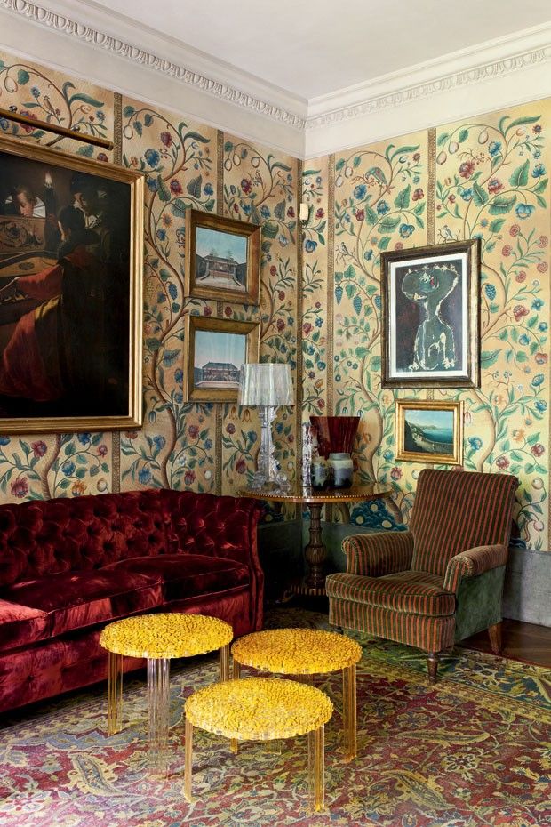
sun room

design crisis | leos rule

design crisis | leos rule

I've had several of these things on the brain for a while now, things like Henri Rousseau everything. I need for my entire house to look like those paintings, and plan to move in that direction as soon as I have more than two spare seconds (and dollars) to rub together. And when I am finished executing that marvelous vision, I will put a giant honking brass lion door knocker on top and call it a day.

While you contemplate that deliciousness, I will be putting on face putty and nice clothes and maybe even high heels, and pretending that I am not old... at least not yet. Another year bites the dust.

At least I have goodish hair.

Palette Cleanser

Is it just me or are things looking really overdecorated lately? This might come across as a little ironic since I recently swathed a powder room in crazy marble wallpaper, but I can't help it. My eyes are tired. It seems like every room has to have trim and contrasting pattern and 75 colors and fully accessorized vignettes and statement furniture everywhere. I'm not judging, for I am most definitely guilty of all infractions. And don't get me wrong, I will always have a flair for the dramatic and a soft spot for this: design crisis

That is super weird. I love it, and I will always love wallpaper. But like I said, my eyes are bleeding from all the stuff in every picture everywhere and I feel an overwhelming urge to clean up the visual clutter.

design crisis | palette cleanser

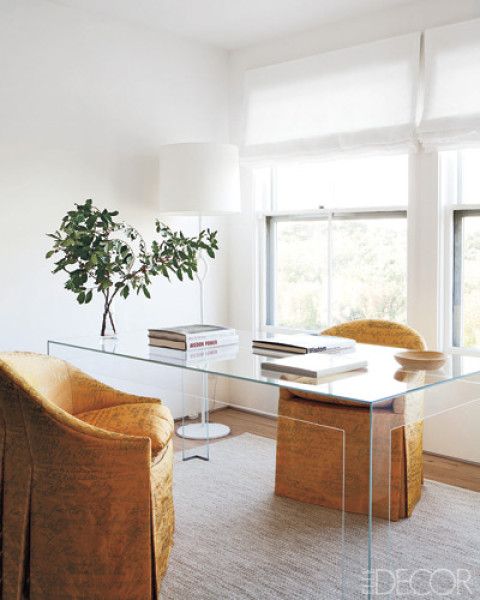
AHHHHHH isn't that nice? Does anyone actually live here? Who cares?! It's all about organizing the room around one statement moment and then editing everything else out. Like a fine ocular sorbet.

design crisis | palette cleanser

White paint makes that easy. If you have great light and good architecture, white paint works. Personally I don't think I can ever live with white white whiiiite paint, because we have a lot of sheetrock and not a lot of windows. I might be feeling anti ornamental at the moment, but if you live in a sheetrock shack you're going to have to do some decorating.

design crisis | palette cleanser

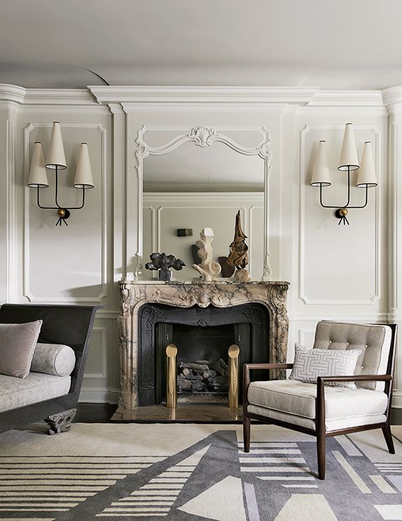
Even dirty off white is more forgiving. This is a nice amount of ornamentalism for me. There is a lot going on here, but keeping things neutral and monochromatic lets the eye rest.

design crisis | palette cleanser

For those of us with yucky architecture and light, color may be a necessity. I don't think cleaning house necessarily means painting everything in neutrals and going gently into that good night. Robert Couturier is my homeboy because he knows how to let even a fancy room breathe. Bold color on the walls and wee pattern on the sofas dictates neutral art, no pillows (!!!), very little clutter, and curtains that don't pop. Matching sofas reduces the number of design elements in a large room. This is a space that could be translated to a real person's house for sure.

design crisis | palette cleanser

Or how about a mostly tonal room with zero pattern? So doable. The focus is all on the delicious yet judicious use of color. It might even be nutritious.

design crisis | palette cleanser

Same idea, but as a kitchen. Sexy, moody, interesting, and clean as a whistle.

design crisis | palette cleanser

I have to admit it is hard not to love a good white room, though. The architecture and textural elements here are layered enough to keep things lively, and that lamp is everything.

design crisis | palette cleanser

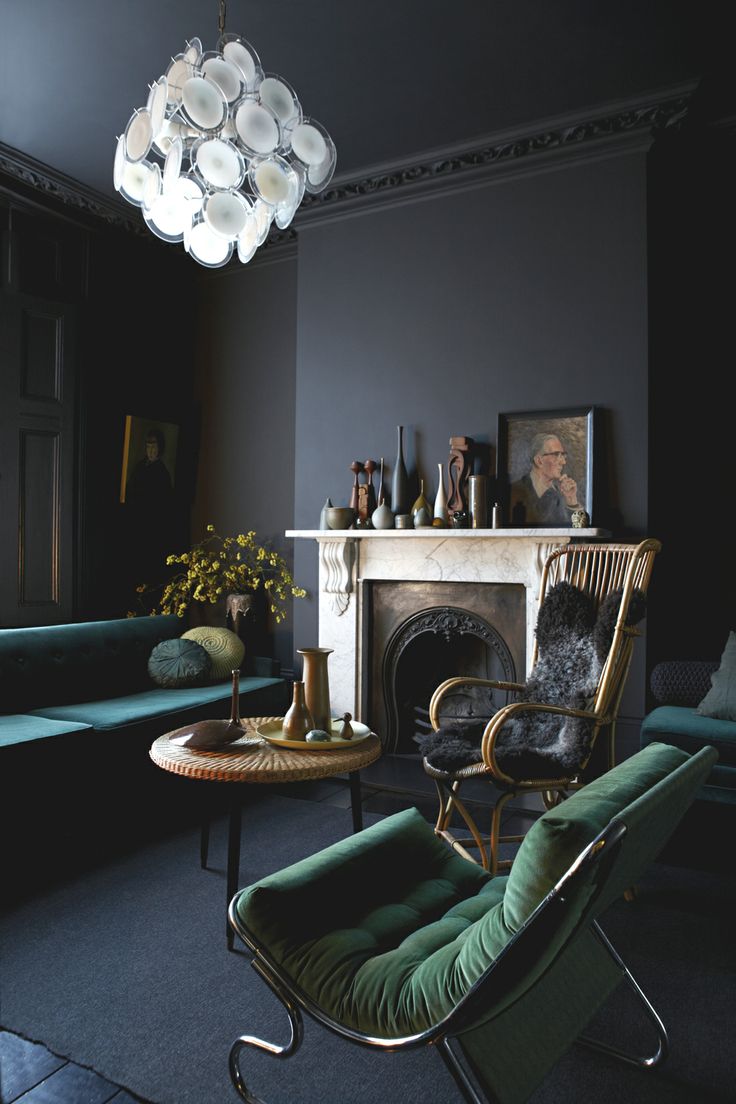
At the opposite end of the spectrum, a bright white Vistosi chandelier in an otherwise dark room has impact without punching you in the face. The paint color and furnishings are unique, but everything else is kinda blendy and nothing is upstaging the diva.

design crisis | palette cleanser

Blendy blendy, but not blandy. It's all about the floors and that bizarrely awesome chandelier.

design crisis | palette cleanser

This is like the good twin to my evil twin powder room. I really wanted everything to feel like it was chiseled from the same material. It might have helped if I had 10K to spend on marble, but I think I did ok with $300 spent on wallpaper.

design crisis

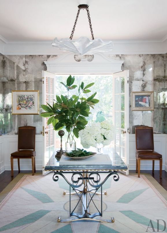
And then there is this room. There are quite a few design elements going on, but the balance is good. I spy plenty of breathing room. It's clean and fresh and interesting. I want to live here. That rug!

Isn't it nice be simple sometimes?

One Room Challenge: Week Six -- Reveal!

Hi everyone, welcome back for the final week of the One Room Challenge! For the past six weeks a host of bloggers have worked tirelessly to take one room from a zero to a hero. [Catch up on past weeks HERE.] Let me tell you something: this challenge ain't for wimps or wussies. Six weeks ago my husband loved me, my children recognized me, and I weighed five pounds less. Apparently the threat of utter public humiliation makes me hungry. Was it worth it? I don't know, donuts are pretty delicious. Imagine this bathroom is a giant frosted donut. Nom nom.

erin williamson | design crisis

I really hope you like it, because I kind of love it. It's magic mushroom mystery submarine crazy. I so very much wish you could come visit in person because this is the hardest room in the universe to photograph EVER. And unlike most photoshoots where I am piling laundry into corners out of the camera's view, I think this space looks so much better in person.

erin williamson | design crisis

Also it is tiny so there are really only two angles, but somehow I managed to take 300 pictures. I hope you like to look at pictures of my bathroom on the internet. Let's hit the rundown.

erin williamson | design crisis

You may recall that I scored this handsome Altman's faucet on ebay. Some days I wake up filled with worry... will the brass trend die a horrible chevronesque death due to ubiquity and overuse? It might. But if you like it, do it. I think someone famous said that once.

erin williamson | design crisis

Cb2 Torked it out of the park with this mirror. It really goes everywhere, and it especially works when you have a lot of things happening in a small space. Pare. It. Down. It's awesome, except after we (Ben) hung it I decided it was about two inches too high and now there is a big hole in the wallpaper, but don't worry you can't see it because I am a wizard with concealer.

erin williamson |design crisis

My pare it down principle somehow does not extend to lighting, because when faced with electrified shiny things I can't seem not to take it to the maxxx. I am in sweet love with this Mazzega chandelier I picked up off ebay for pennies on the dollar. I swear this thing is 20x more impressive in real life. It's spun from Charlotte's webs and angel tears.

erin-williamson-design-crisis-23

After we (Ben) hung it, I decided it was two inches too high so I made him lengthen the chain, which required disassembling and reassembling with held breath and eyes wide shut. The fear of possible breakage will continue to give me ptsd for weeks.

erin-williamson-design-crisis-20

Ike was sooooo excited about this soap dish -- this glass soap dish that I didn't want him to use. He actually started crying when I tried to take it out of HIS bathroom. Because he thinks the bathroom belongs to him. Don't say I never spoil you, kid. You can have the soap dish too.

When it came time to hang last week's proposed lucite towel ring, I balked. I couldn't figure out what was wrong with me until I scrolled through my ginormous collection of bathrooms on pinterest and realized that none of my favorites had a towel ring. Zero. A few had petite towel bars, which at least keep things nice and flat instead of scrunched up and germy. I decided I didn't want anything hanging on that wall... it just felt cluttered. Then I decided I hate regular hand towels so I "made" these from a vintage linen tablecloth with metallic embroidery, and by made I mean "tore artfully."

erin williamson |design crisis

All is not lost, lucite lovers. I did end up using the paper holder with fancy BLACK toilet paper, courtesy of my sweet friend Rebecca who knows my heart's desires so well.

erin williamson | design crisis

How have I lived so long without black toilet paper that my children aren't allowed to use? It's amazing. Thank you, Rebecca! When I opened the box I almost wept with delight and maybe a little bit of first world self loathing. The fact that it's a gift makes it ok. SCORE.

erin williamson | design crisis

Speaking of great friends, let's talk about my amazing art courtesy of Gillian Bryce Fine Art. I have 800 million paintings, but this wallpaper is tricky. Nothing I had worked and I was slightly EXTREMELY panicked, but I stalked the 214 Modern Vintage booth at High Point via facebook like it's my job (it is). And then I spied this beauty amongst a host of angelic creations including many beatific William Fredericksen paintings and collages (also obsessed). Gillian overnighted this hero to me... I'm kind of speechless in love with her and the art. That is service, y'all. I highly recommend checking out her giant art collection. It's excellent.

erin williamson | design crisis

Did you notice the spray painted blinds? Thanks to all my instagram buds who encouraged me to paint my fingers and toes black. I'm happy to report that it worked pretty well (on the blinds). We'll see how they hold up to a baby who likes to eat the wooden bobs. Please don't call CPS. I know the heimlich.

So I think that's it for my sources. Want to see a little freestyle action? These are the moments (cue teary montage):

erin williamson | design crisis

erin williamson | design crisis

erin williamson | design crisis

erin williamson | design crisis

And what would a makeover challenge be without a proper before and after? Put on your sunglasses, because the before pictures might blind the old and infirm. That's not you, right?

BEFORE:

erin-williamson-orc-8

AFTER:

erin williamson | design crisis

erin williamson | design crisis

erin williamson | design crisis

erin williamson | design crisis

And that, my friends, brings us to the end of our soap operatic journey through shame and into redemption. It's been a long, dusty, expensive road, and I think I've earned a bottle of something cheap and strong to celebrate.

Thank you ever so much to Linda of Calling it Home for organizing and hosting such a lovely and talented group of designers and bloggers! This challenge gets better every round, and I'm honored to have been included. If you haven't already, please do go visit the other participants to see their epic finales.

I myself plan to bust out a donut, drink some ripple, and try not to make Ben hang anything two inches away from perfection for at least the rest of the day. Until next time!

Abby M. Interiors

Because it’s Awesome

Bijou & Boheme

Calling It Home

Chez V

Chinoiserie Chic

Copy Cat Chic

The Decorista

Design Crisis

Design Indulgence

Design Manifest

The English Room

The Glam Pad

Little Black Door

Mimosa Lane

My Notting Hill

The Pink Pagoda

Simple Details

My Sweet Savannah

Verandah House